The product brief behind every Amazon listing we design (and what it does to conversion)
.png)
The Amazon listings that convert customers add information a shopper needs to make a decision. We call this signal density, and it runs against most design advice, which pushes brands toward clean, minimal images. A minimal image that leaves out the one detail a shopper was looking for sends them to the next listing in the search results.
If you asked your designer for the document their images were built from, would there be one?
So before we open a design file, we catalog everything the listing could say and the proof behind each claim. That document is the product brief.
yourAMZ was founded in 2016 by people who learned Amazon as operators, selling our own products and running a 10,000 sq. ft. Amazon 3PL. We've now worked with 50+ brands doing 7-8 figures per year, and every listing we design starts from a brief built the same way. Below are the key sections we focus on, illustrated with a real image or A+ module from a listing we designed for one of our clients (every example in this post is our own work), followed by what this process has done to conversion rates.
Why the brief comes before the design
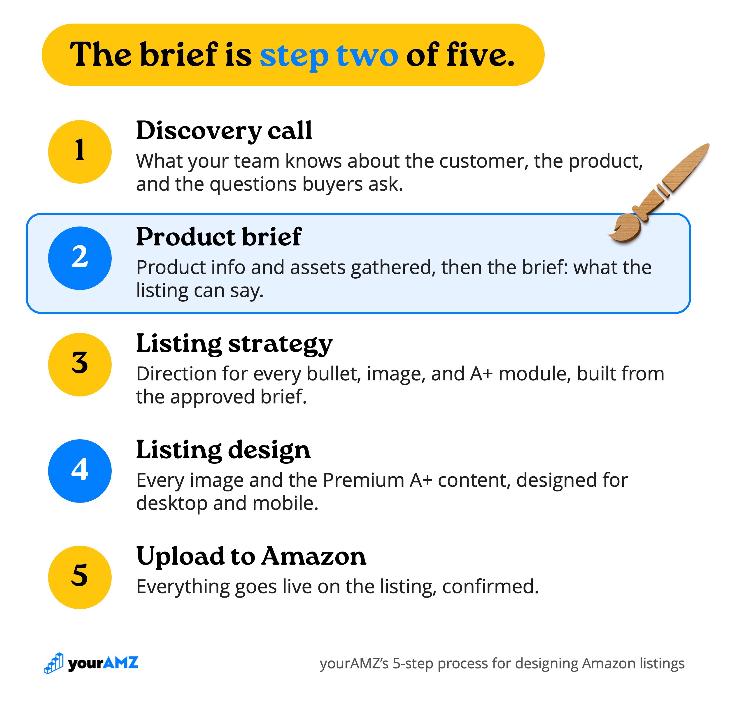
The brief is step two of the five steps we follow on every listing project:
- Discovery call: we capture what your team knows about the customer, the product, and the questions buyers ask.
- Product brief: we combine our discovery call findings and research findings into a single brief.
- Listing strategy: from the approved brief, we set the direction for each piece of content on the listing page.
- Listing design: all listing visuals, designed for desktop and mobile.
- Upload to Amazon: we upload everything to the listing and confirm it's live.
The brief defines what we can say, and the listing strategy decides how we say it. We think of it as ingredients and a recipe: the brief stocks the kitchen with all the ingredients, and the strategy is how those ingredients turn into a recipe.
Your PDP content, video ads, display ads, social media content, influencer campaigns, PR campaigns, and more can all be born out of the product brief, which makes it valuable as a standalone deliverable.
Nothing in the brief is final copy, and some of it never reaches the listing at all. The client approves it before design starts, so every bullet, image, and A+ module is built on an understanding both teams agreed to before the strategy begins.
When a designer works without a brief, they fill the gaps with guesses. The images can look great and still miss the questions the shopper came to the page with. And when you're advertising, you pay for every one of those visits whether the shopper buys or not.
1. Who are we selling to?
Hollywood learned long ago to start with the customer. At a recent M-Squared conference I attended in Boston, I heard Daniel Rosenberg, a former Hollywood producer who is now a brand strategist and founding partner of Piro, explain that studios wouldn't even entertain a movie idea unless it came with an audience to sell it to. One of the most established industries in the world won't produce anything until it knows who will buy it, and a listing deserves the same discipline.
Every brief starts with these questions:
- Who is buying?
- Why are they buying?
- Why now?
We answer these questions in the same section, because an age range alone tells a designer who to put in the photo but not what that person should be doing in it.
We separate end users from buyers, since they're often different people (an adult child buying for a parent, for example). Then for each segment we record three things:
- Pain: the problem they want solved
- Desire: what they want their life to look like instead
- Trigger: what is causing them to look for a solution today
Here's how that played out on Bened Life's brain-health supplement. The product is built for adults 50 and older. The segment that shaped the lifestyle image below was the professional in their 50s and 60s:
- Pain: worried about losing their edge at work, keeping up with faster, younger coworkers
- Desire: staying sharp and effective through the later years of their career
- Trigger: new coworkers outpacing them and performance pressure rising
So the image puts a woman in her 50s, in professional attire with a laptop in hand, at the center of the frame, looking confident and capable. The headline states the age outright because, for this product, age is a constraint. Our rule for audience callouts is to state the audience only when it's a constraint.

2. Benefits with evidence
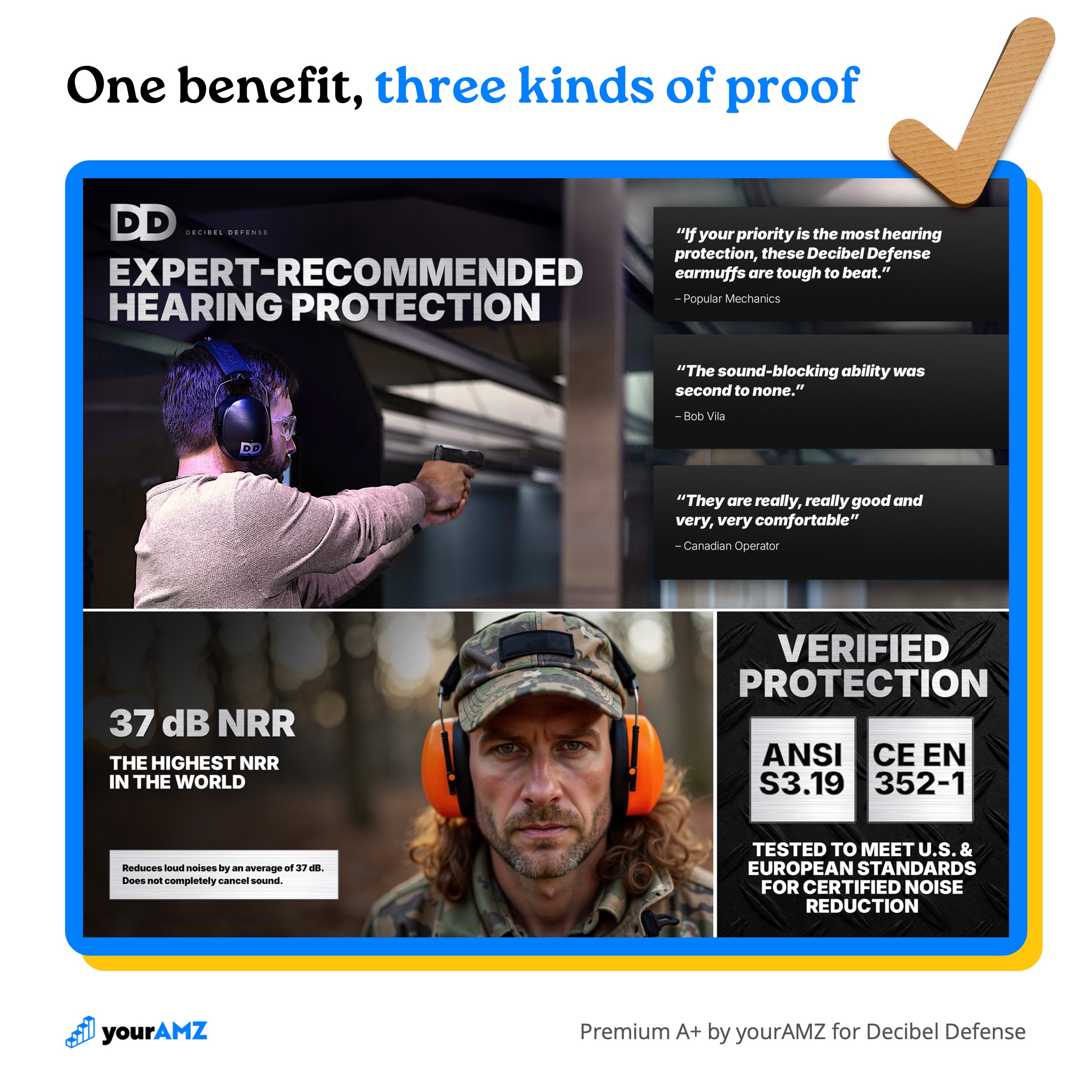
Decibel Defense's core benefit is maximum, professional-grade hearing protection for loud environments. Any earmuff on the first page of search results could make the same claim. What makes a shopper believe it from one brand over another is the evidence attached, so the brief never lists a benefit without its reasons to believe (RTBs).
We sort RTBs into six types and gather as many as the product can honestly support.
For Decibel Defense's core benefit, the brief stacked up five of the six:
- Features: an industry-leading 37 dB Noise Reduction Rating (NRR)
- Real results: in a self-reported survey of 67 customers, 93% said Decibel Defense is better than other earmuffs they've used
- Third-party endorsements: mentions from Bob Vila, Popular Mechanics, and BGR, plus ANSI S3.19 and CE EN 352-1 certifications
- Social proof: 300K+ units sold and real customer reviews
- Guarantees: a 100% satisfaction guarantee
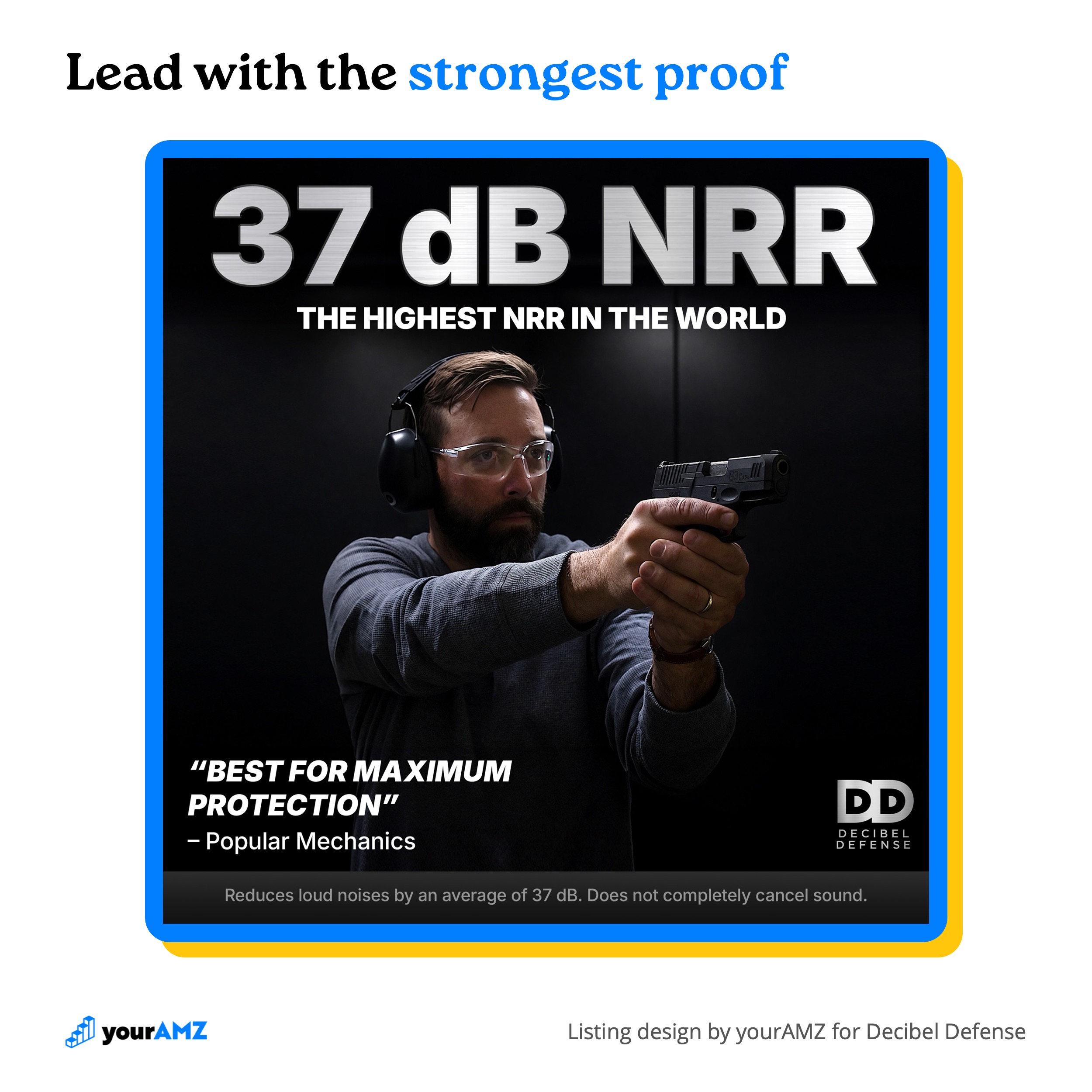
The first listing image (below) leads with the strongest RTB, putting "37 dB NRR" in the largest type on the page, and pairs it with Popular Mechanics calling it "best for maximum protection." Usually RTBs back up a benefit claim, but this one was strong enough to lead as the headline.
The first two Premium A+ modules keep stacking evidence: three expert quotes under "Expert-Recommended Hearing Protection," the 37 dB NRR again, and both certifications under "Verified Protection." By the time a shopper scrolls past them, "maximum protection" has a number, three experts, and two certifications behind it.
3. Answer the questions that stop the sale
Some shoppers are already sold on the product and still don't buy. They believe the benefits, they can live with the price, but one unanswered question stops them at the Add to Cart button. We sort those questions into two kinds:
- Lack of clarity: facts the shopper needs before they can commit. Will it fit? Is it compatible? What exactly is in the box?
- Concerns: doubts about whether the product will deliver for their situation. Is it worth the higher price? Will it even work?
Clarity gaps are the easier fix, because the answer already exists and simply isn't on the page yet: size and fit, compatibility with what the shopper already owns, what's in the box, and more.
Each of these protects the brand after the sale too. A shopper who guesses wrong on size sends the product back, and often leaves a review blaming it. Clarity fixes are returns fixes. Every return eats into your margin, can cost you a sellable unit, and can bring a bad review with it. The worst case is a unit Amazon marks unfulfillable: if it isn't removed, it can end up liquidated and resold by a reseller on your own listing, at a price low enough to take your Buy Box.
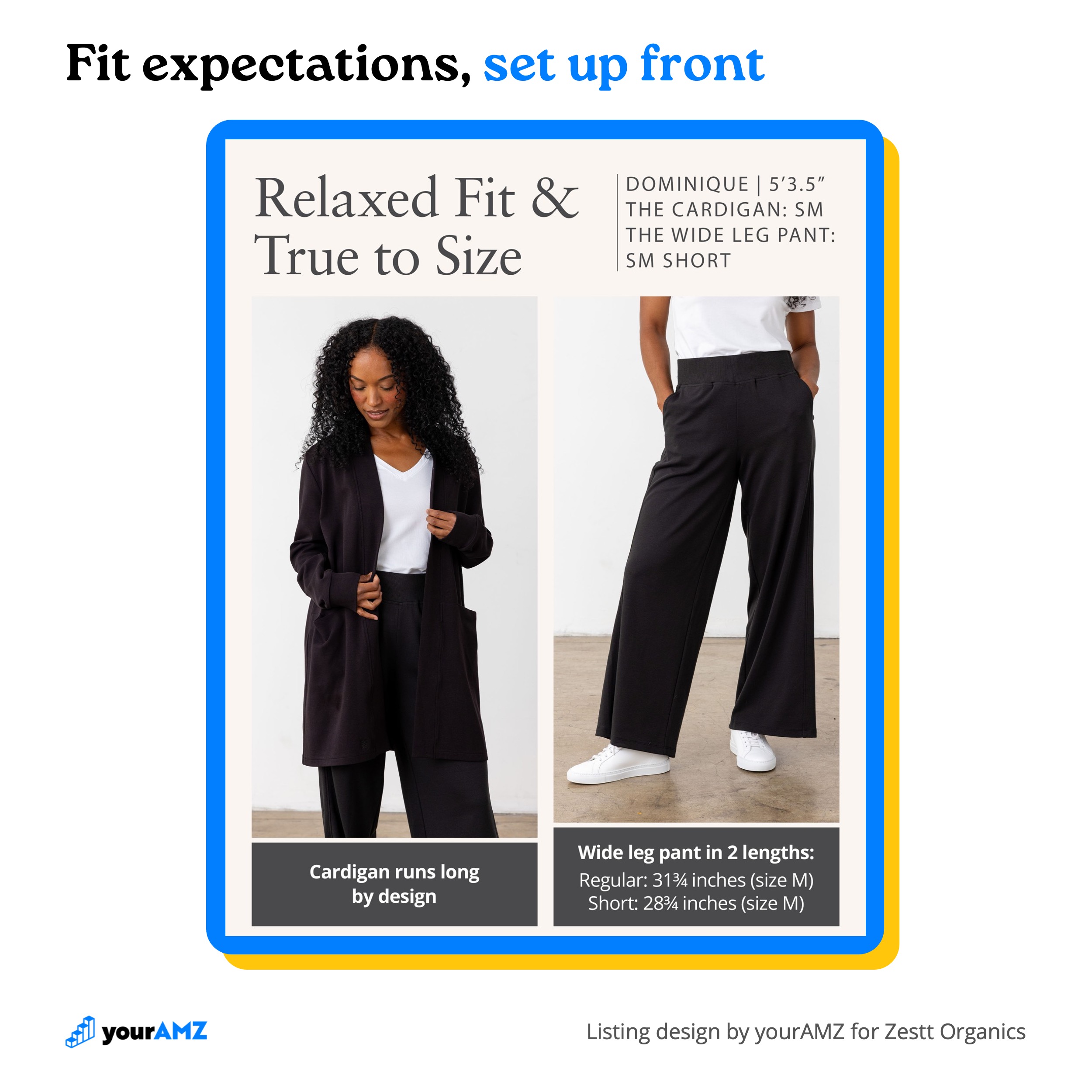
For Zestt Organics' travel clothing sets, sizing is the question shoppers ask most. The brief broke it into three questions the listing had to answer:
- Which size do I order? The sets fit true to size, so the listing says outright to order your usual size.
- How will it fit? The fit is relaxed, and the cardigan and quarter zip run long by design. Said up front, an oversized fit reads as the intended style instead of a sizing mistake.
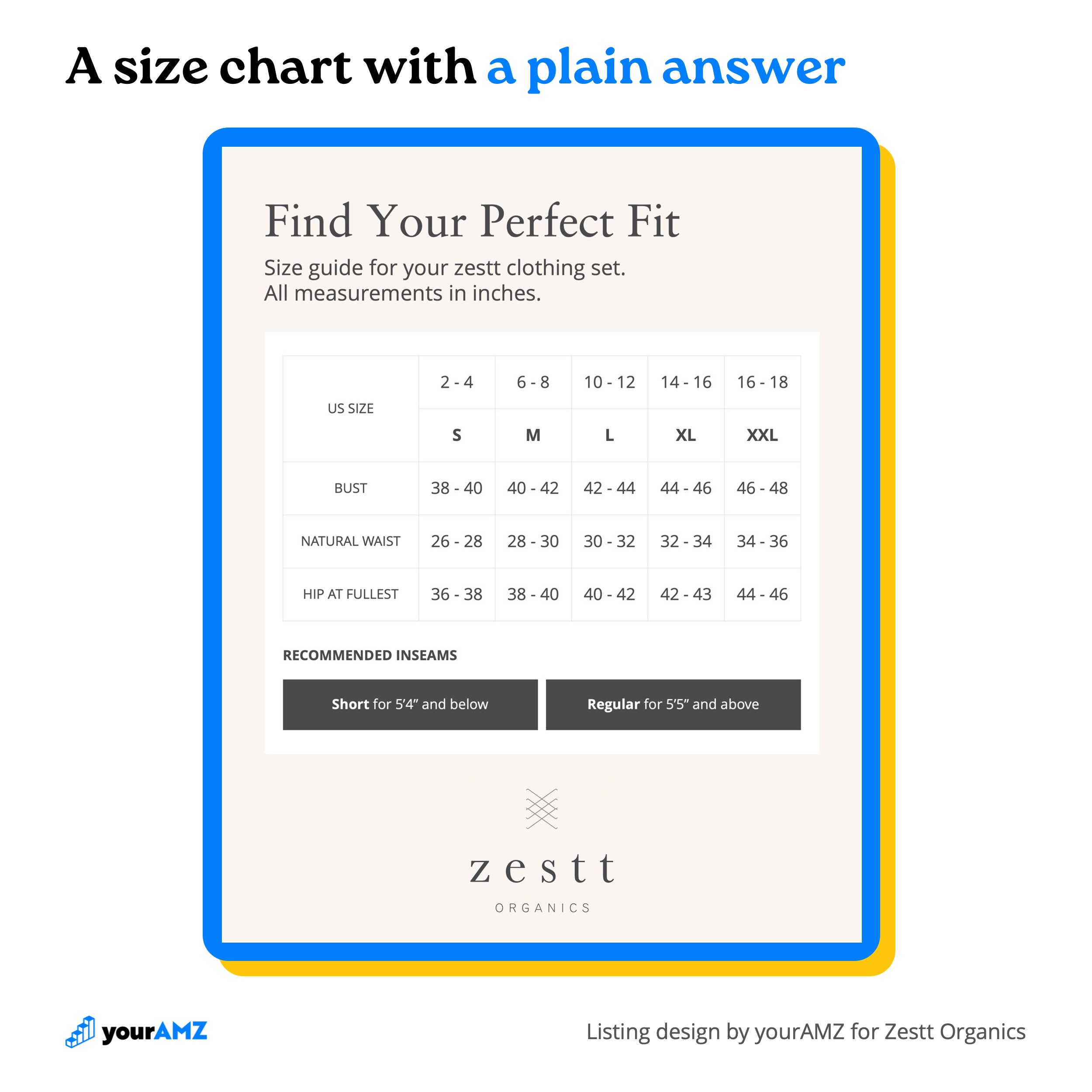
- Short or Regular? The wide leg pant comes in two inseams, a choice that makes shoppers nervous. Measurements alone weren't enough, so the brief called for an explicit recommendation by height.
The image below answers the first two. "Relaxed Fit & True to Size" sits in the headline, next to the model's height and the exact sizes she's wearing, with "Cardigan runs long by design" and both pant inseams in inches underneath.
The size chart follows with body measurements for every size and ends on the recommendation shoppers wanted most: Short for 5'4" and below, Regular for 5'5" and above.
Sizing is a clarity problem. The concern we run into most, on nearly every premium or high-margin product we work on, is whether the price is worth it. It comes up often enough that it gets its own part of the brief, which is the next section: perceived value per dollar.
4. Make the price worth paying (Perceived Value Per Dollar)
A price only looks expensive when the perceived value behind it is low. Shoppers buy when the value they see is greater than what they pay:
Perceived value ÷ price > 1
So the brief raises the value side of the equation, using six levers:
- Economy: saves money
- Efficiency: saves time
- Convenience: lowers effort
- Utility: does more than one job
- Assurance: lowers risk
- Status: elevates identity
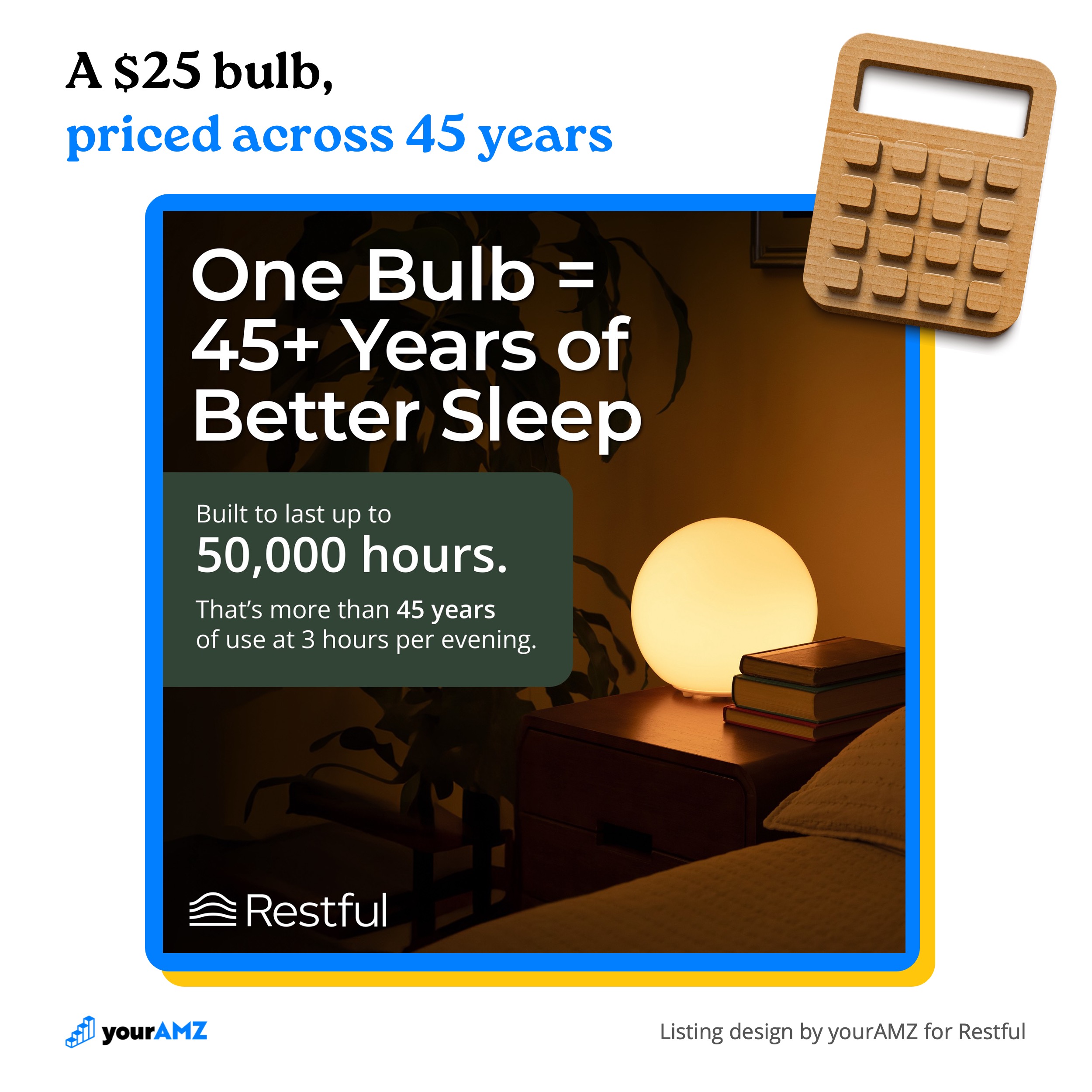
Restful sells a 2-pack of warm, low-flicker bulbs for $49.99, about $25 per bulb. Search "light bulb" on Amazon and the top two organic results are 6-packs for $9.99, or $1.67 per bulb. A shopper comparing per-bulb prices sees Restful at about 15x the cost of the first bulbs they find.
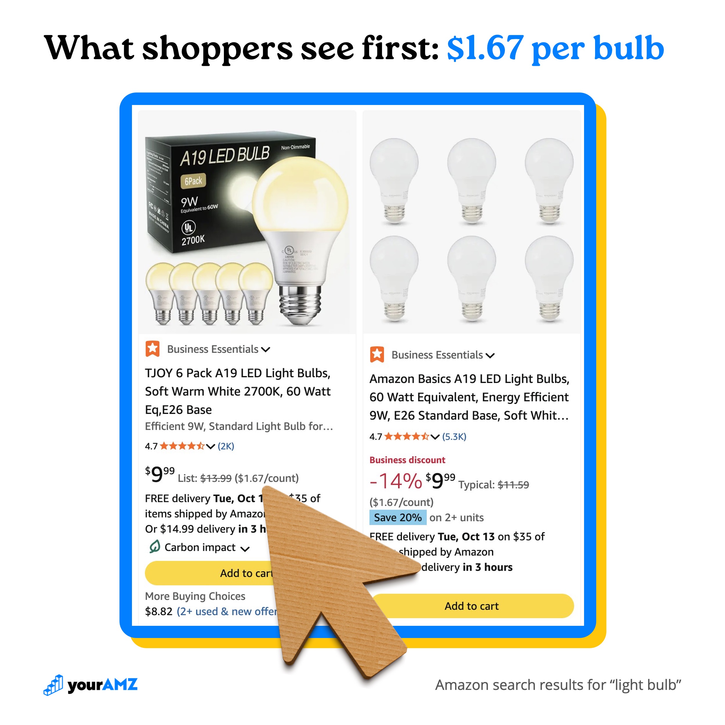
The brief found the answer in how long the bulb lasts. Each one is rated for up to 50,000 hours, which works out to more than 45 years at 3 hours per evening. That single fact pulls three levers at once:
- Economy, because the shopper won't be buying replacements.
- Convenience and Efficiency, because they won't be spending the time or effort to change the bulb.
So the image leads with it in the headline, "One Bulb = 45+ Years of Better Sleep," with the 50,000-hour math spelled out underneath.
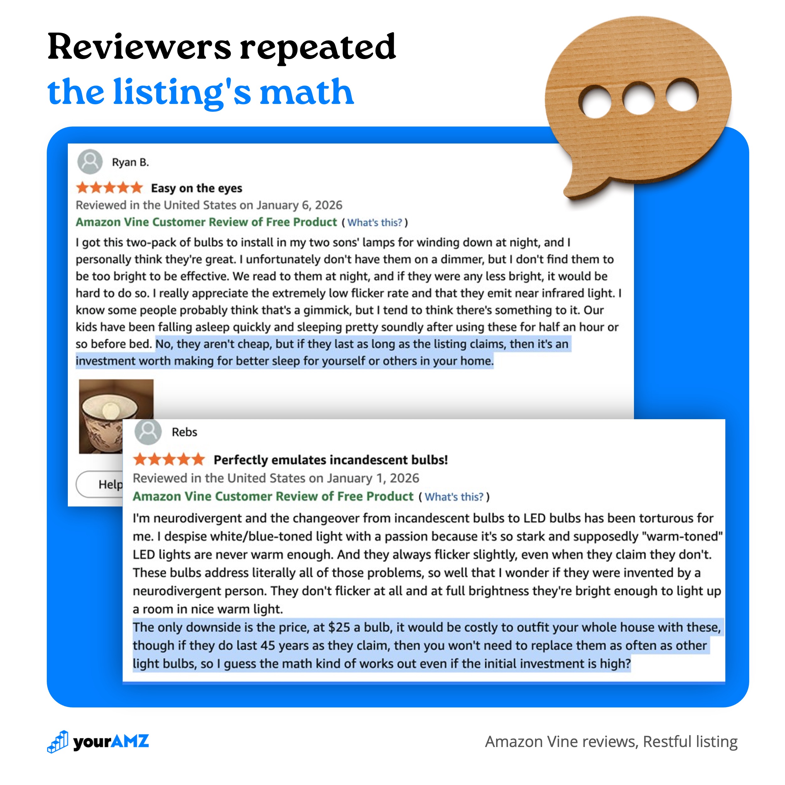
The effect showed up in the first reviews. Of Restful's first 20 Vine reviews, 4 brought up the price, and each one weighed it against how long the bulbs are built to last. One reviewer called them an investment worth making for better sleep. Another worked through the math themselves and decided it works out even with the higher upfront cost. Shoppers were repeating the listing's argument back to the next shopper.
When the perceived value sits well above the price, a brand can charge more and still win the sale. A premium brand shouldn't have to lean on discounts to sell. The listing should show why you're better and convert on its own, so a promotion adds fuel to a fire that's already burning.
5. Why choose us over the competition?
Benefits tell a shopper what the product does. Points of difference tell them why this one beats the alternatives they're already weighing. So the brief starts by naming what the shopper is comparing against: direct competitors, and alternative ways to solve the same problem, whether they already own one or are considering buying one.
For Brod & Taylor's Bread Steel Duo, the direct competitors were pizza stones and smaller steels that fit one loaf at a time, and the main alternative was a Dutch oven.
Against those, two of the brief's points of difference carry the images below:
- Two-loaf capacity: most steels are sized for one pizza or one loaf
- Faster heat transfer than stone: stronger oven spring and crust
The listing leads with both, in the first three images of the stack:
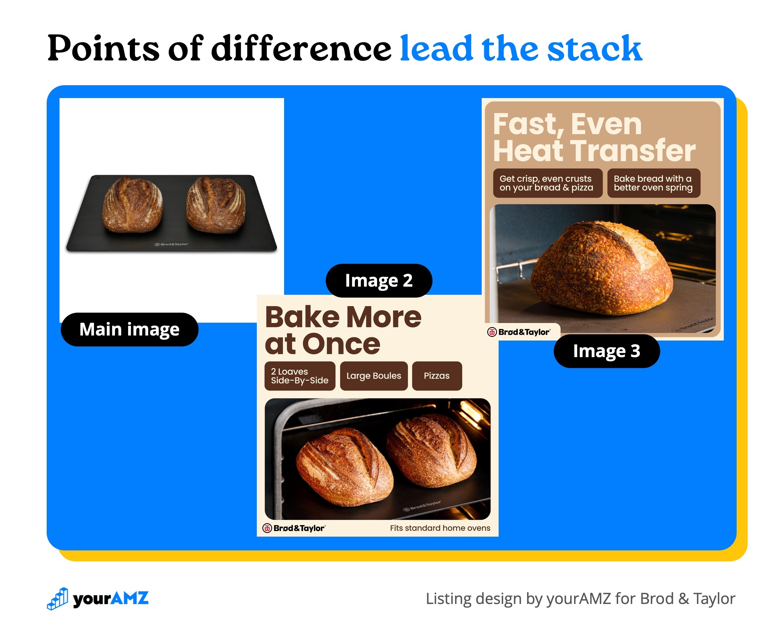
- Main image: the steel with two loaves side by side, so the difference shows in the search results before a shopper opens the page.
- Image 2: "Bake More at Once" says it in words, with two loaves, large boules, and pizzas, in a standard home oven.
- Image 3: "Fast, Even Heat Transfer" turns the second difference into what a baker sees: crisp, even crusts and better oven spring.
A difference earns the lead spot when a shopper can see it at a glance and it matches the reason they're shopping. The brief's purchase trigger was a baker who had outgrown a setup that bakes one loaf at a time, and two loaves side by side answers that before a word is read.
6. Profit strategies
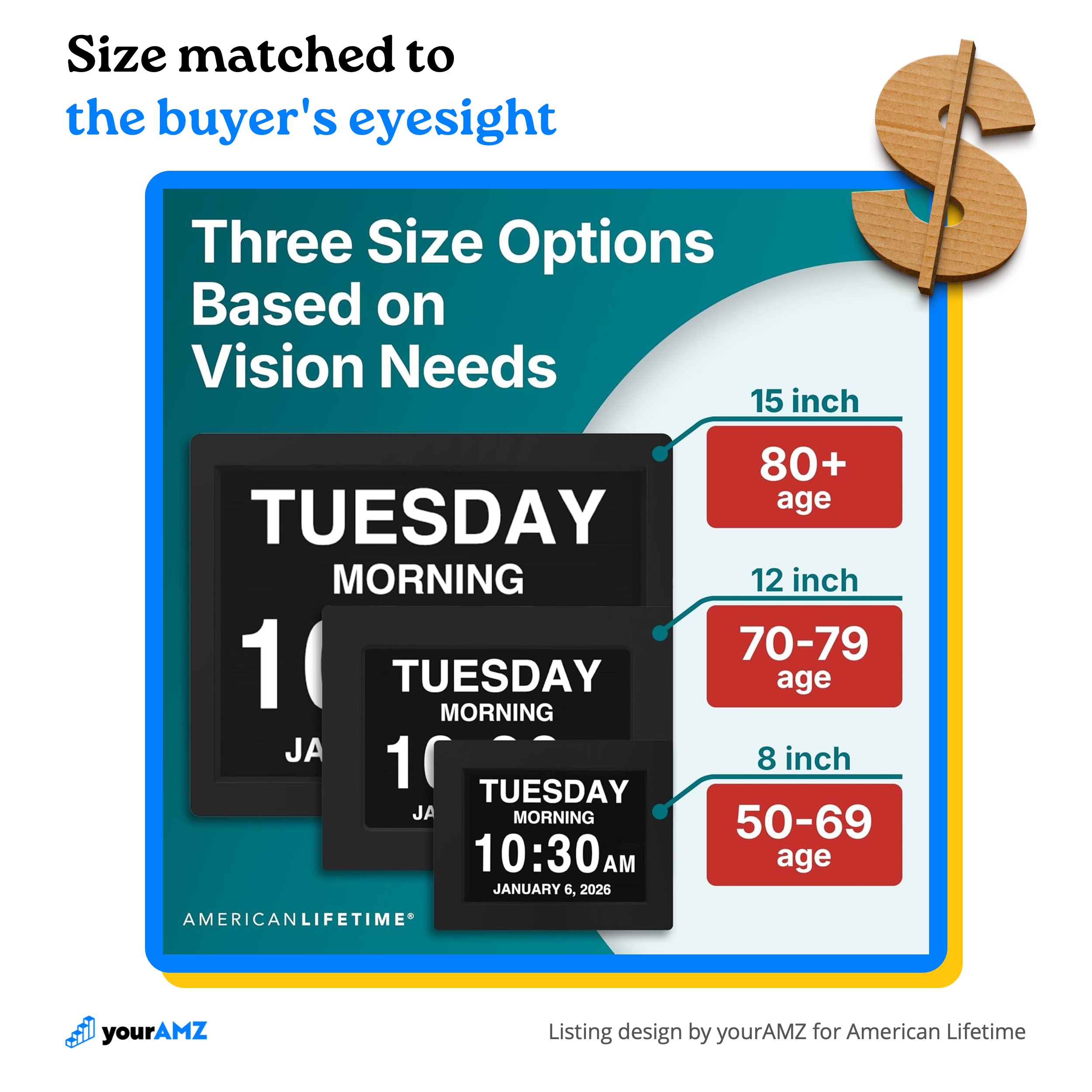
I first learned to give this its own section on a project for American Lifetime's day clock. The clock comes in three sizes, and the listing was built to move shoppers who clicked the 8-inch model from search up to a larger one:
- 8-inch: $59.99
- 12-inch: $119.99
- 15-inch: $199.99
Shoppers pick a size with very little to go on. Most click the cheapest option in the search results and buy it, unless something on the page tells them a different size fits their situation better. The brief tied size to eyesight, so the listing does too: the image below matches each size to an age range, from 50-69 for the 8-inch up to 80+ for the 15-inch.
An upsell like this costs nothing extra in advertising. The order still comes from the same paid click, so moving even a small share of shoppers up a size raises revenue without raising ad spend. Here's the math on a hypothetical 100 orders from shoppers who clicked the 8-inch model, if 10% of them move up to the 12-inch and another 10% move up to the 15-inch:
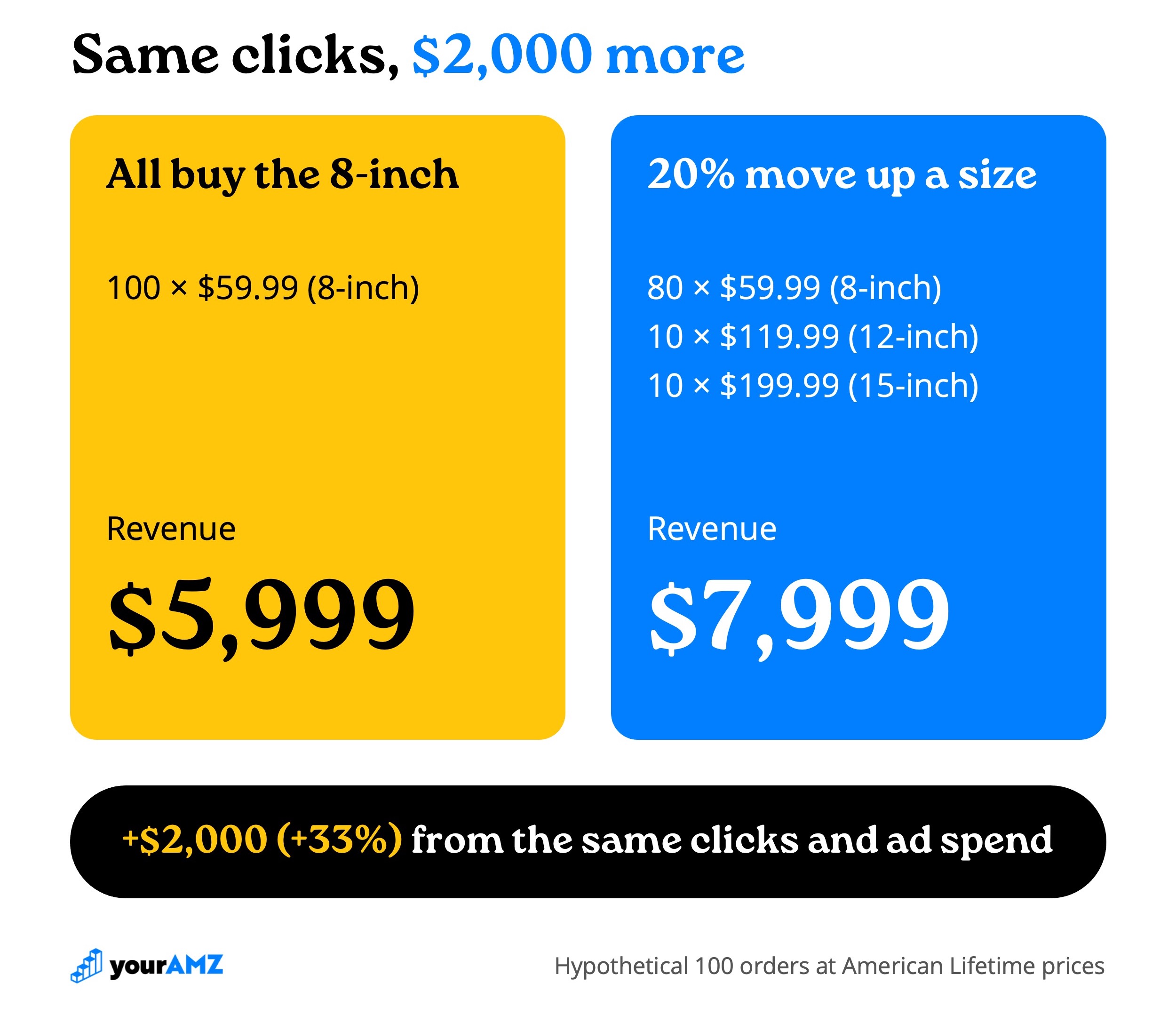
That's $2,000 more, a 33% lift, from the same clicks and the same ad spend. The 12-inch costs twice as much as the 8-inch and the 15-inch about 3.3x as much, so each shopper who moves up is worth two to three regular orders.
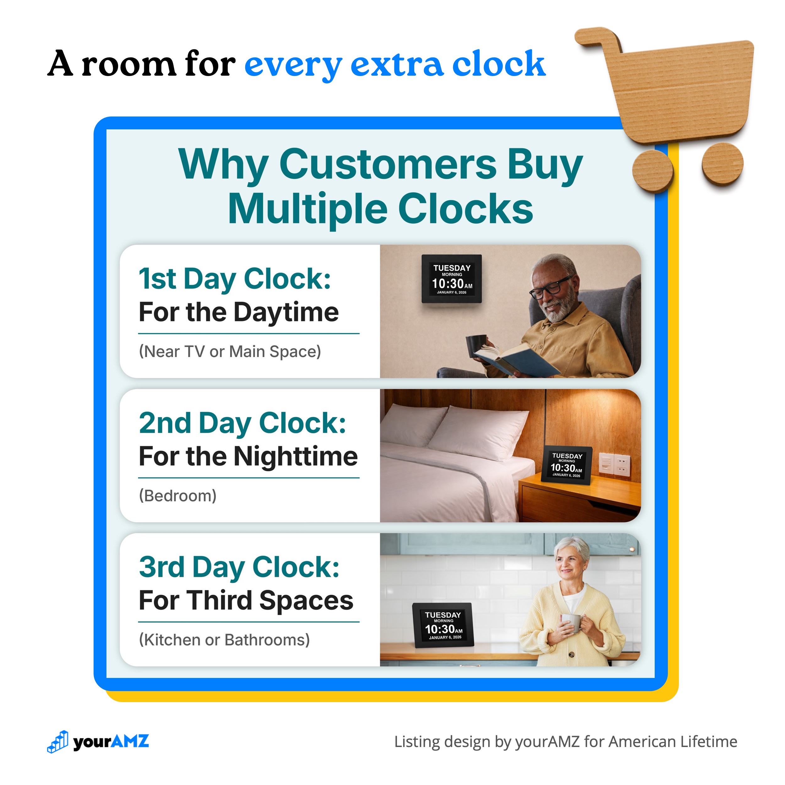
The listing's other AOV play was getting customers to buy more than one clock. Customers often keep their day clock near the TV, so the brief proposed a clock for each part of the day: one in the main living space, one in the bedroom for nighttime, and one in the kitchen or bathroom. The image below lays out all three rooms, which makes two or three clocks look like the normal setup for a home.
Average order value is one of three profit levers the brief looks for. The other two also raise profit without raising ad spend: more repeat orders (a refill, a subscription, or a reason to buy a second unit) and fewer returns, which the sizing work in section 3 is built to prevent.
7. Sentiment analysis
Reviews are the closest thing to a free focus group a brand will ever get. When a product already has reviews, on Amazon or the brand's own site, we read them and sort what customers praise from what they complain about. The praise that repeats most goes on the listing, because those are the reasons real buyers ended up happy, ranked by how often they said so.
FinaMill's Classic Battery Mill Ultimate Gift Set is a spice mill that grinds from interchangeable pods, one spice per pod. In its reviews, four positives came up again and again, and each one found a place on the listing:
- Switching spices is easy. The most repeated positive by a wide margin, usually about changing between salt and pepper.
- A dedicated pod per spice. Reviewers described running a pod each for sea salt, kosher salt, black pepper, red pepper, and sesame seeds.
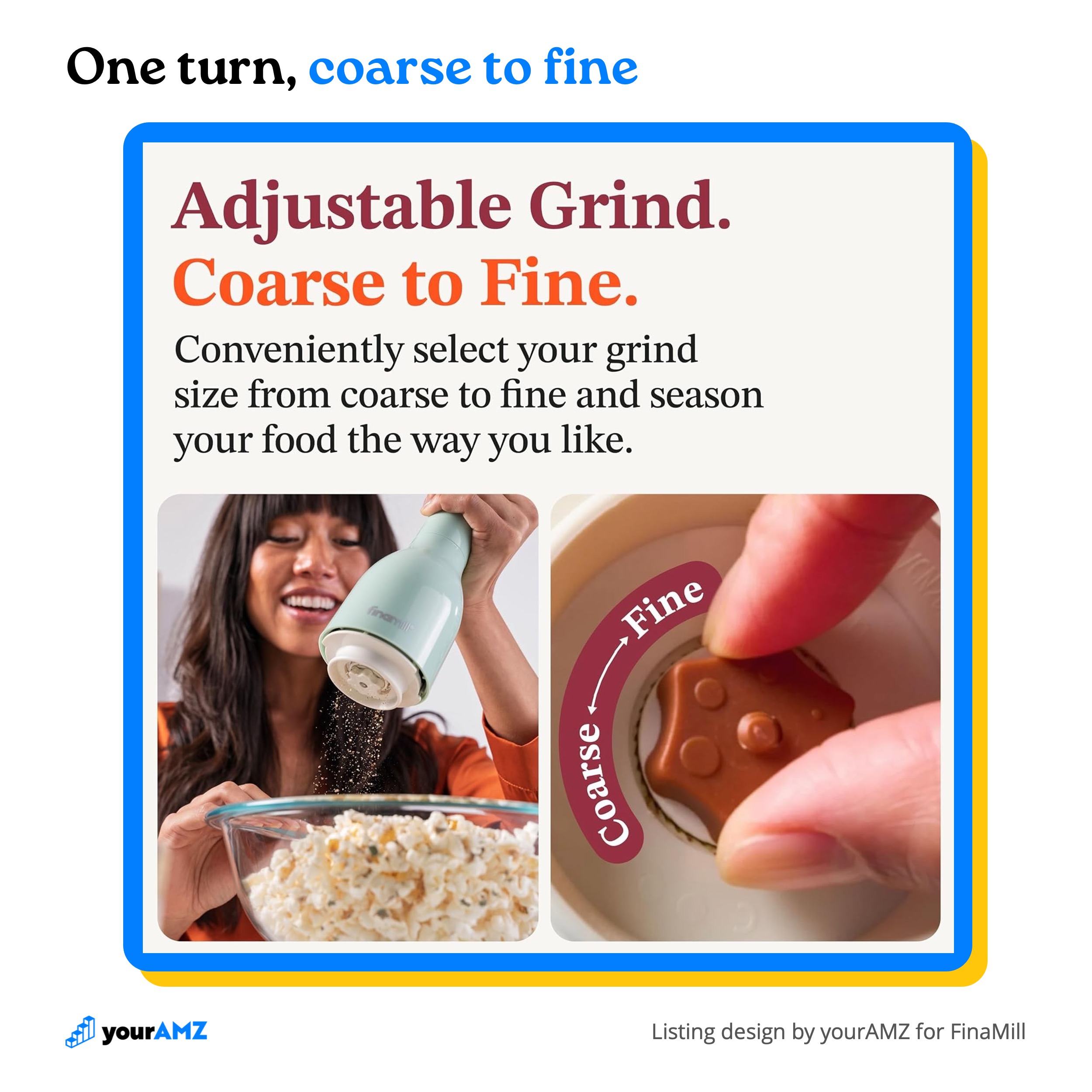
- Adjustable coarseness, with several reviewers liking that fine to coarse takes one turn.
- Easy, mess-free filling and refilling.
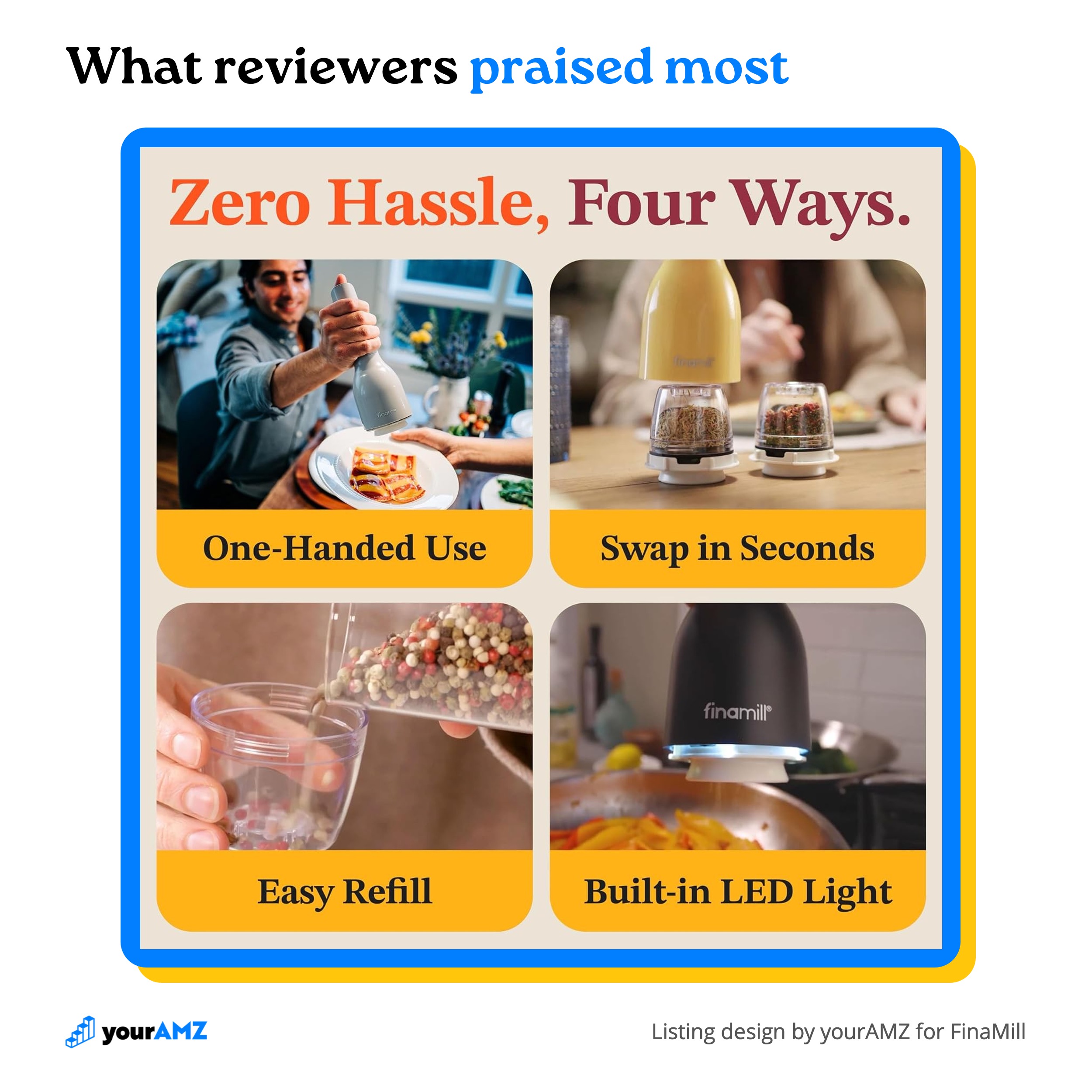
Two of the four, easy switching and easy refilling, anchor the "Zero Hassle, Four Ways" image, next to one-handed use and the built-in LED light.
Adjustable coarseness got its own image, with the grind dial shown up close, coarse to fine.
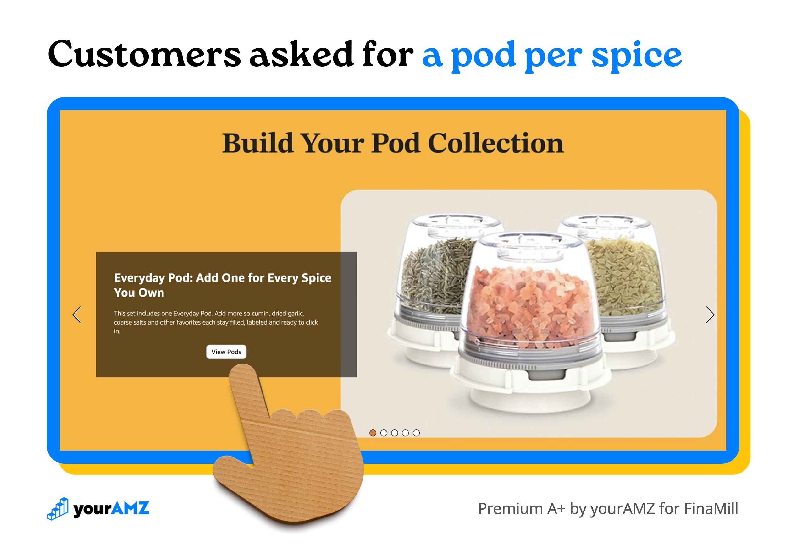
The dedicated-pod praise doubled as a profit strategy. The gift set includes one of each of FinaMill's four pod types, and reviewers kept describing a pod for every spice they cook with. So the A+ content includes a carousel of all four pods, each with a clickable button, written around adding one for every spice you own. A gift set buyer who already likes the idea can add more pods to the cart before checking out.
8. Why they should trust the brand
Everything so far sells the product. This section sells the company behind it, and a brand shoppers trust converts better on every product it sells, across the whole catalog.
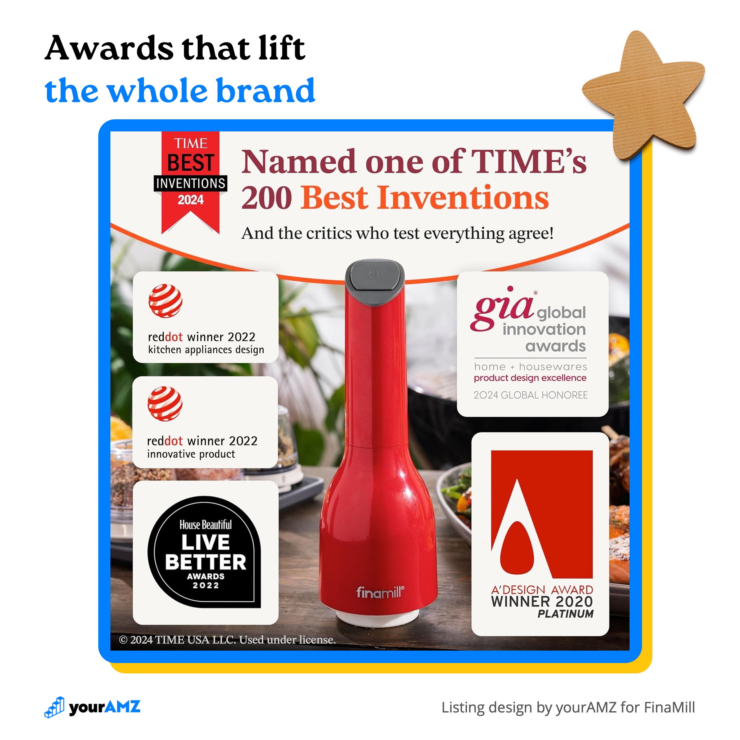
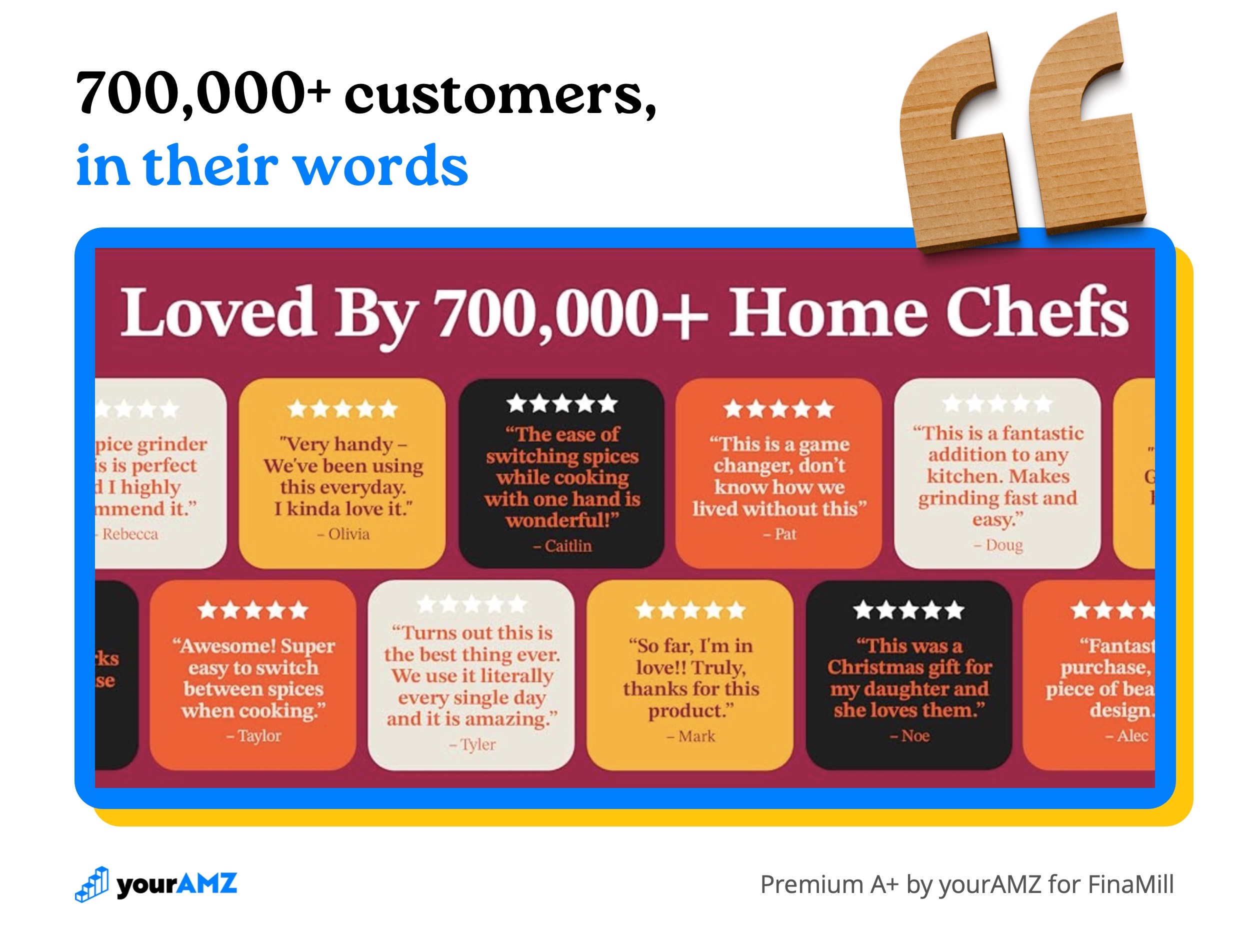
FinaMill had an unusually deep stack to draw from: named one of TIME's 200 Best Inventions of 2024, two Red Dot awards, several other design honors, and more than 700,000 home chefs using the mill. The listing repeats that proof in the image stack, the brand story, and the A+ content, so shoppers see it wherever they land on the page.
9. Prohibited claims & visuals
The brief also records what the listing must never say: claims Amazon or regulators don't allow, claims that aren't true, and claims the brand chooses not to make. Writing them down before design starts keeps a persuasive headline from turning into a suppressed listing, a return, or a one-star review.
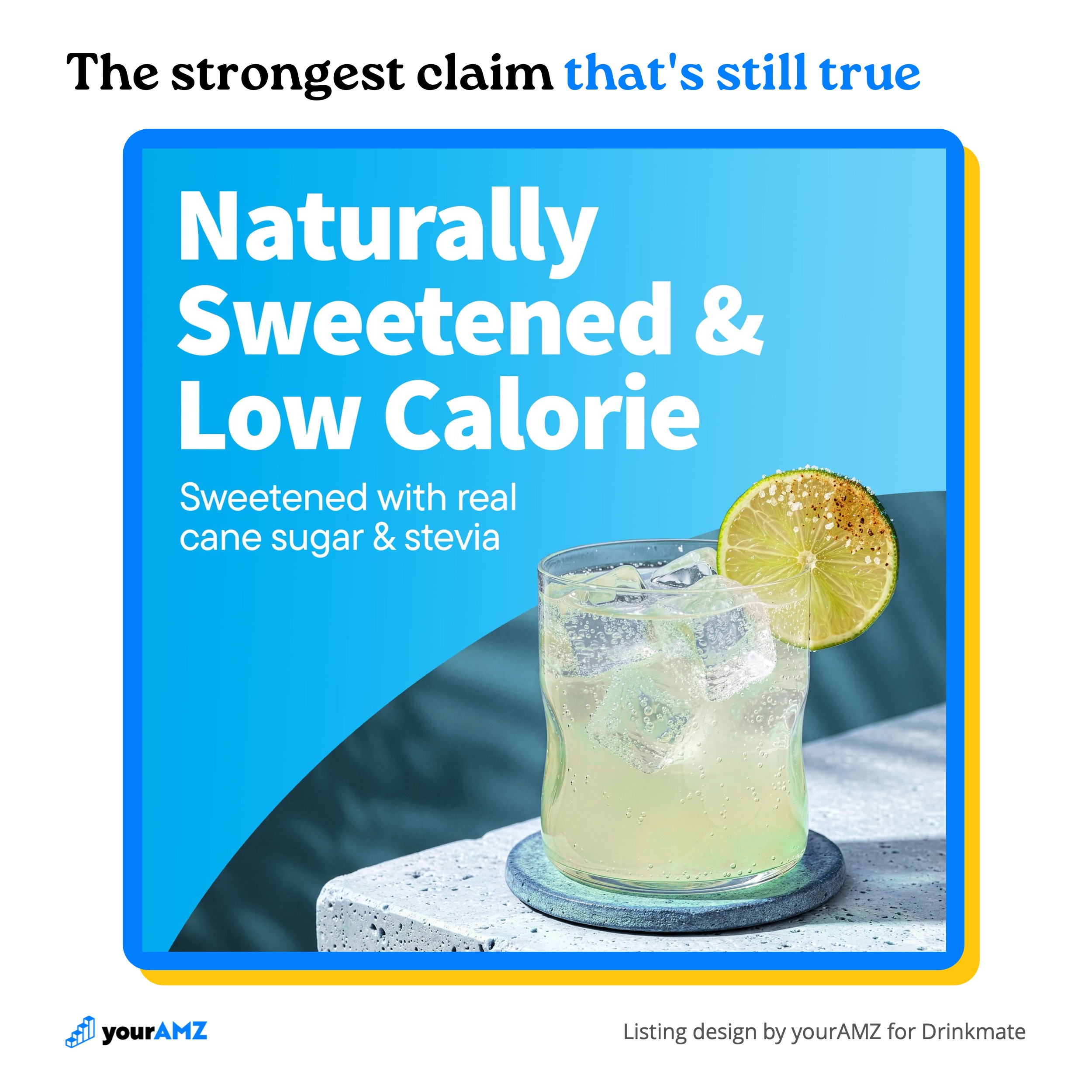
"Sugar-free" or "zero calorie" would have been an easy headline for Drinkmate's Premium Italian Syrups. Neither is true, since the syrups use real cane sugar. The brief also ruled out "all natural ingredients," because the packaging says "naturally flavored."
The image below makes the strongest claim that's still true: naturally sweetened and low calorie, with real cane sugar and stevia named outright, so the shopper who reads the label finds exactly what the listing promised.
What the brief does to conversion
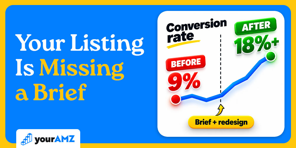
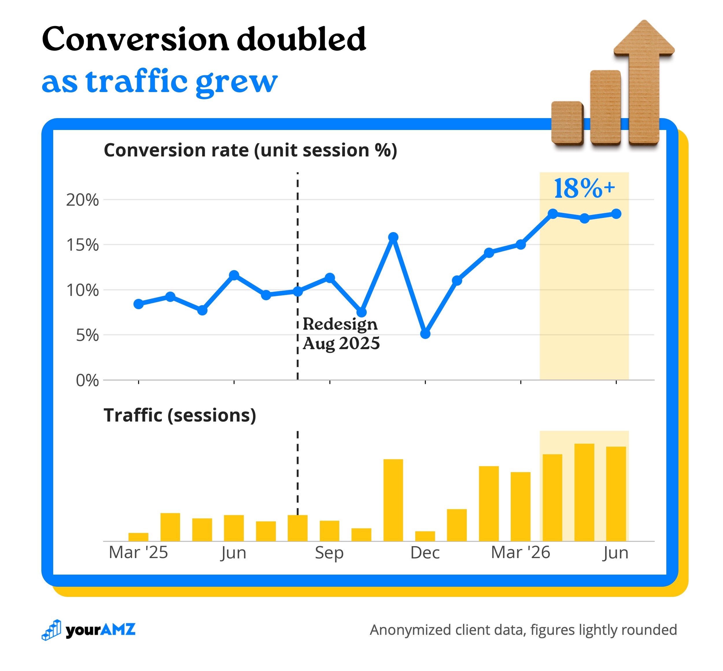
A home improvement brand's hero listing launched in March 2025 and converted at about 8-10% for its first several months, with one month near 12%, measured by unit session percentage (Amazon's conversion rate). We rebuilt the listing from a brief in August 2025.
Inventory problems hid the result at first, with stock dips in October and December. Once the product stayed in stock, conversion climbed to 14% in February, 15% in March, and then over 18% for three straight months, April through June 2026. Those same months brought the listing's highest traffic, roughly 20,000 sessions per month. More traffic usually pulls conversion down. This listing converted better as traffic grew, at roughly double its pre-redesign rate. At the same traffic, twice the conversion rate means twice the orders from the same ad budget.
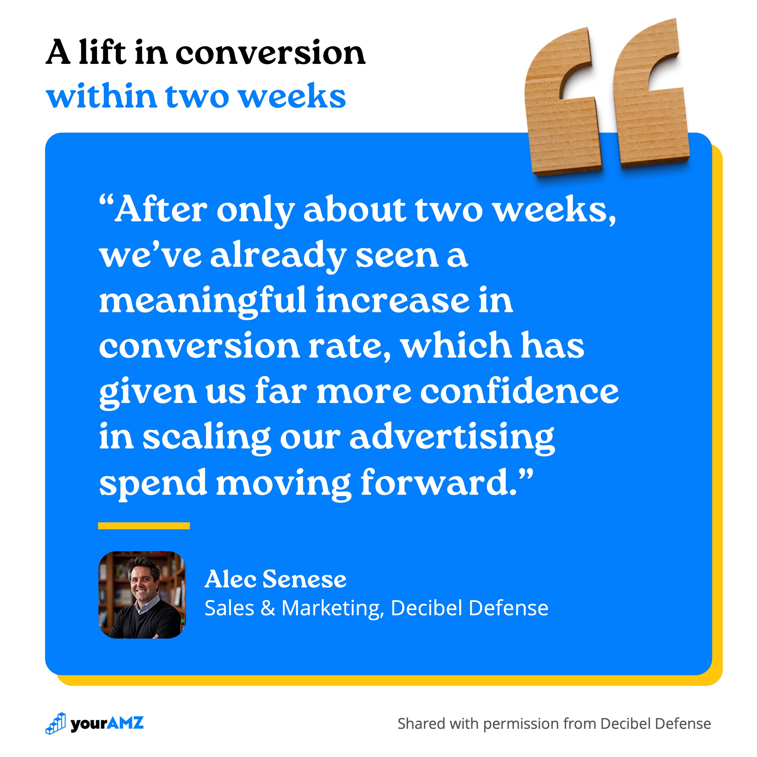
The effect can show up fast. Decibel Defense saw it within two weeks of their new listing going live. Alec Senese, Sales & Marketing, put it this way:
A listing that converts better makes every ad dollar sent to it work harder, which gives a brand the room to spend more.
Identifying details changed and figures lightly rounded for the home improvement example.
Is your listing the bottleneck?
A better brief raises conversion, which only helps if conversion is what's holding your brand back. Often the listing converts well enough and the ad account is where the money leaks: budget going to searches that never convert, proven winners starved of spend, or branded clicks flattering the numbers. A new listing design can't fix any of that.
Our free advertising audit shows you which problem you have. We build it from your own account data and walk you through it on a call: where your ad spend is working, where it's being wasted, and the wins you can take right away. If conversion rate turns out to be your biggest constraint, the audit will show that too, before you spend anything on design.
The audit is built for brands doing $100K+ per month on Amazon.
Get your free advertising audit
Unlock Your Amazon Potential
%20(1).avif)
Continue Reading
Your Amazon ads have a location blind spot (with Ken Sheehan of KnoWhere)